Client: Interreg
My role: Graphic design
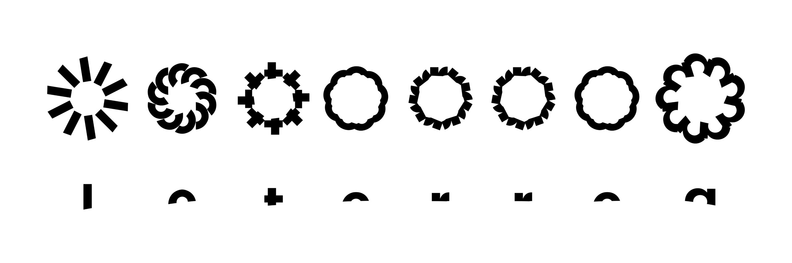
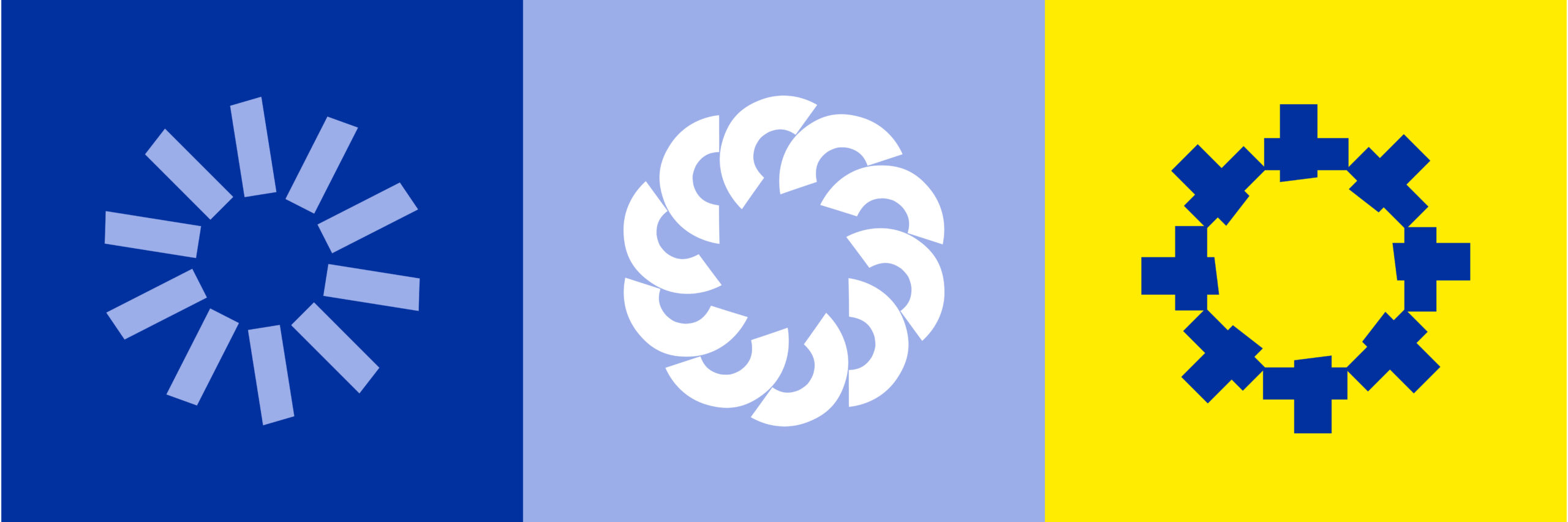
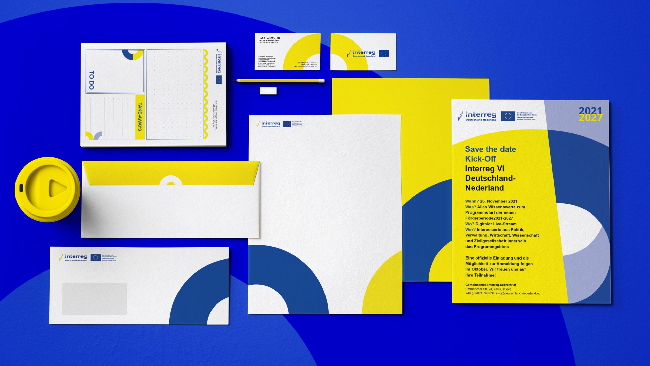
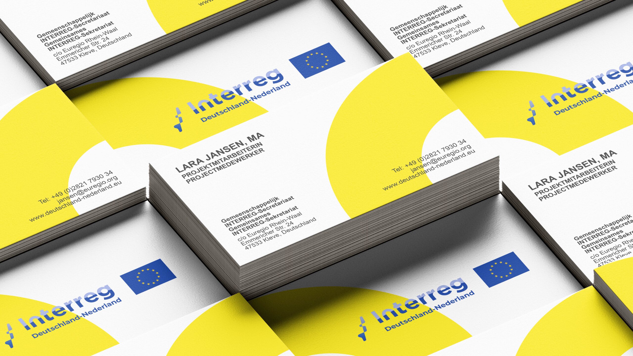
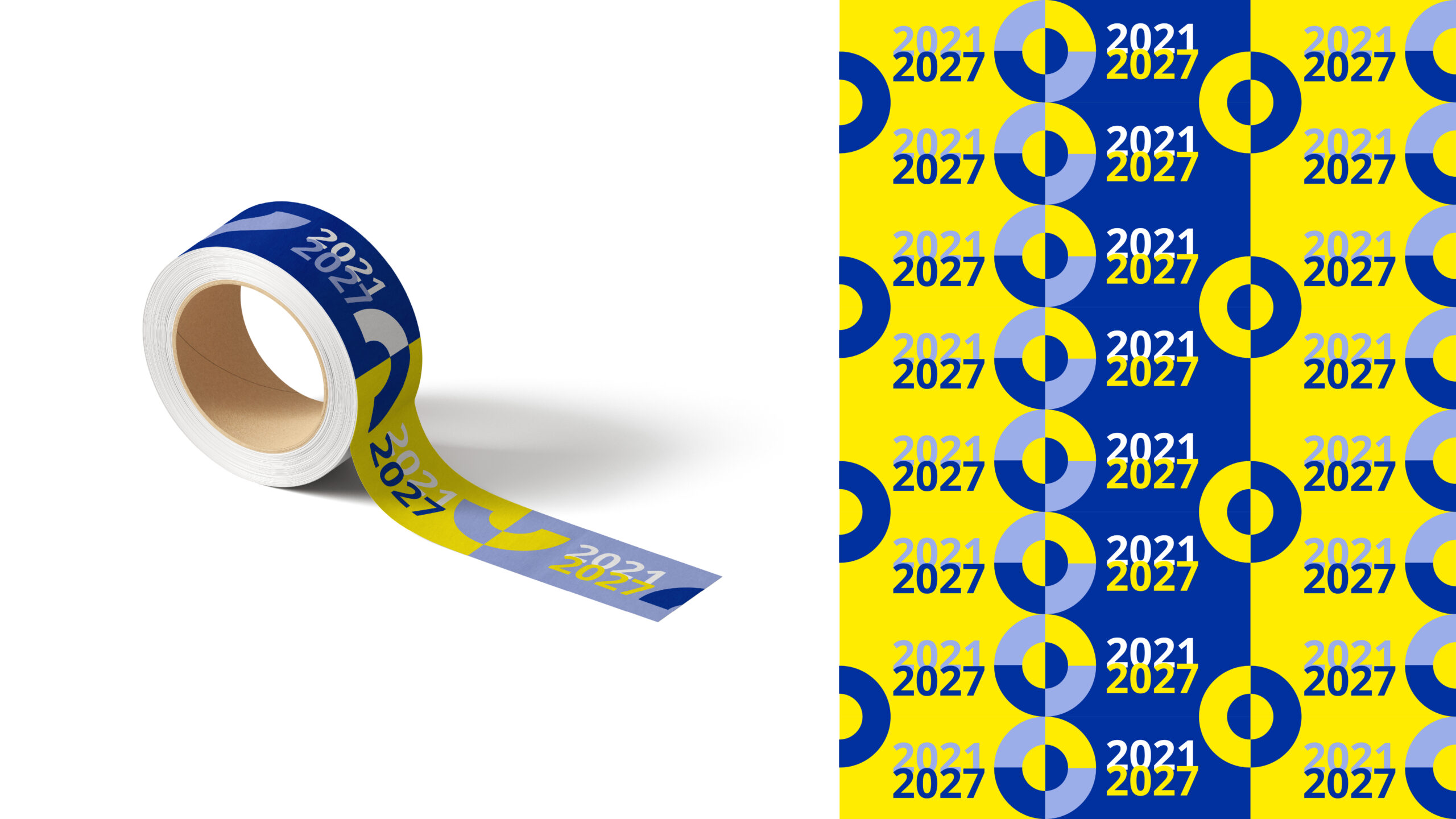
Interreg Europe supports regional and local governments across Europe in developing and delivering improved policies. For the 2021 event, I contributed to the corporate identity design. Drawing inspiration from the branding’s letter “n,” I utilized its shape as a symbolic bridge connecting Germany and the Netherlands. This element became a key feature, creating continuity throughout the design. I envisioned the corporate identity elements forming metaphorical bridges when aligned side by side, reinforcing the theme of connection and collaboration.